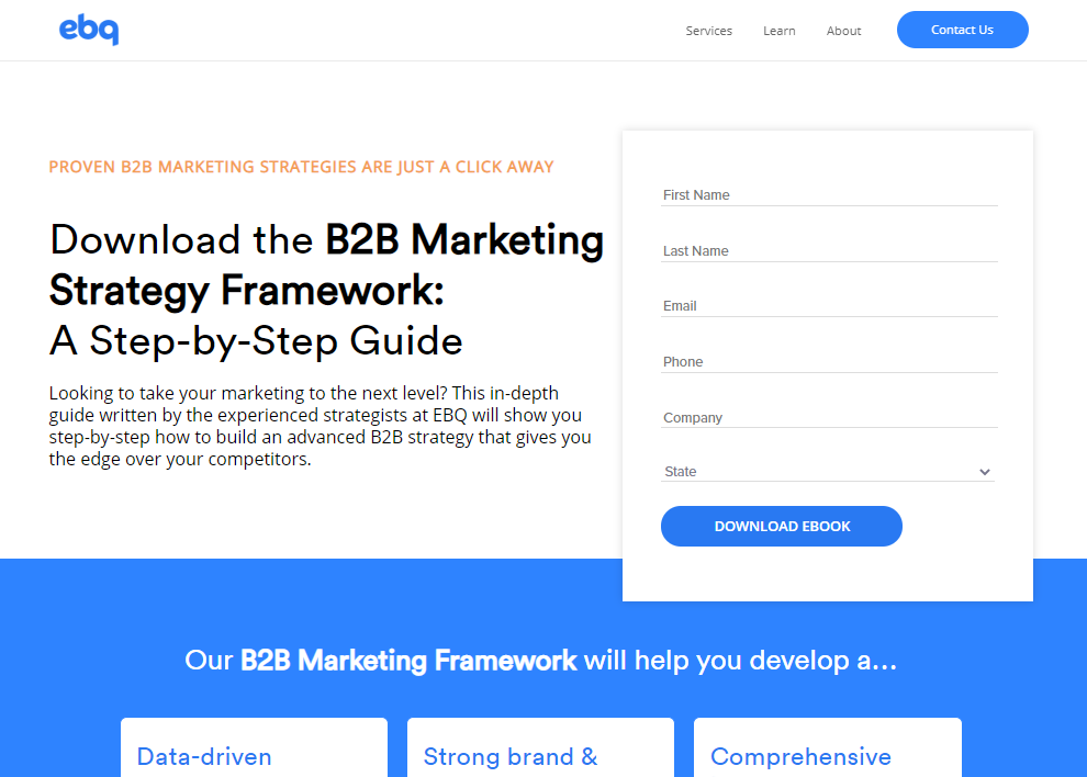
Landing pages are a B2B marketer’s bread and butter — the bottleneck you must master to capture lead information and convert website visitors into Pardot prospects.
Defining landing page goals
Pardot landing page best practices

- Meet expectations: We assume anyone who clicks a button that says “Download your free ebook” is expecting to land on a page that will confirm that action with a headline or subheadline saying the same thing. Your landing page copy should be straightforward and mirror the language visitors see before navigating to the page.
- Sell value: Even though you’re giving away something for free, you’re still selling, and the price is contact information. Include landing page copy that clearly explains the value in the offering. This approach will help increase your landing page successes and decrease your bounce rate.
- Social proof: Adding a customer testimonial or two can help boost your trust and authority with the customer. Unless your brand is well-known, this added piece of credibility is vital. If you have a photo of the person who gave you an excellent review, include it to further reinforce that a real person said it.
- Minimal links away from the landing page: Many landing pages don’t include a navbar, or they use a minimalist version. The logic is that if we get a visitor on our landing page, we don’t want them to leave it. Minimize any distraction that would take them away from the page; the only links worth including will take them to other offers in case they aren’t sold on this one.
- Form design and placement: A form that follows all the best practices from our last section will integrate beautifully with the landing page we’re putting together here. There are differing opinions on where to place a form, and while placing it on the side of the page is common, it’s not necessarily the best. Form placement and layout, in general, comes down to A/B testing and discovering what works best for converting your visitors.
- Include a graphic: Use a graphic that serves as a hero image and contextualizes the offer. If you are giving away a guide on how to wash a car, include a graphic that supports that, such as a dirty car or a car that’s being cleaned. Use graphics that reaffirm the visitor’s expectations. Most out-of-the-box responsive landing page templates in Pardot come with an image you can edit in the WYSIWYG editor.
- Shorten the URL: If you connect bit.ly with your Pardot instance, you can create shortened URLs for your landing pages. This practice can help increase your click-through rate on social media links to your landing pages, as well as tracking the amount of times that link was used.
- Deliver content with an autoresponder email: We’ve all had it happen: a visitor throws a junk email into the form and downloads your whitepaper without giving you a way to reach them. However, if we add an autoresponder email to the form’s completion actions, we can attach the download link to that email, and they’ll only be able to download your offer with a real email address.

B2B Marketer’s Guide to Pardot
Don’t have time to read the full guide right now? Download the B2B Marketer’s Guide to Pardot to read at your convenience.
Pardot landing page design
Colors & color psychology
Typography
Font Size
Redirect to a “thank you” page after a submission
Beyond courtesy, there are two primary reasons to create a thank you page:
- Introduce relevant content to your prospect.
The thank you page is a great place to upsell your marketing content to your new prospects. You might write a message such as:
“Thank you! You will receive your ebook in your email shortly. Here are some other resources you can check out that will complement the guide.” - Google Analytics and Pardot don’t always play nice.
It’s a frustrating aspect of Pardot, but it can be difficult to trigger an event in Google Analytics from within Pardot. It’s doable but can be messy and unreliable. However, you can tie your thank you page to a destination goal type in Google Analytics as a solution.

How to use multivariate testing to test your landing pages
Multivariate testing in Pardot is essentially like running multiple A/B tests in tandem. A/B testing, in a nutshell, is a way of comparing two variations of an element to see which performs better.
For example, you may run an A/B test to compare how button color affects conversion rate. You would publish two pages: one with a yellow button and one with a blue button, with users randomly landing on each version. We would then compare the results and determine which one is better.

With Pardot, there is a very clean process to test these pages. Your visitors are cookied and will only ever see one version of that specific page. Pardot will test all the page variations and determine what the best version of the page is.
It does involve more work, since you have to make a new version of the page for each variable you’re testing, and each version should still only be testing one variable. It’s more akin to running multiple A/B tests simultaneously than a true multivariate analysis.
As with all things digital marketing related, you should always focus on continuous improvement. These are tests you can run constantly to make sure you’re always improving. You can always build a better landing page.

B2B Marketer’s Guide to Pardot
Don’t have time to read the full guide right now? Download the B2B Marketer’s Guide to Pardot to read at your convenience.


