
One of the biggest reasons why business leaders are drawn to Salesforce is their robust reporting capabilities. Their out-of-the-box reports and dashboards help team members of all seniority levels stay organized and productive. However, creating reports in Salesforce can be a challenge for users.
In this chapter, we’ll discuss:
Let’s start by uncovering what Salesforce’s standard report types are.
Don’t have time to read the whole guide right now? Download the PDF version of the guide.
Salesforce standard reports are out-of-the-box reports that can be used to help you get started with your platform journey. A few standard reports include:
Similar to objects and fields, Salesforce also allows you to build custom reports. All reporting can be automatically generated based on your specified criterion, allowing you to track progress and gather necessary data for performance evaluation.
As the name suggests, Salesforce report builder allows you to build reports using their state-of-the-art drag-and-drop feature. This means that you can run robust reports without understanding coding language.
After defining which objects and fields you want your report to display, you can then utilize filters to exclude irrelevant data. We will go over how to build a report step by step in the next section.
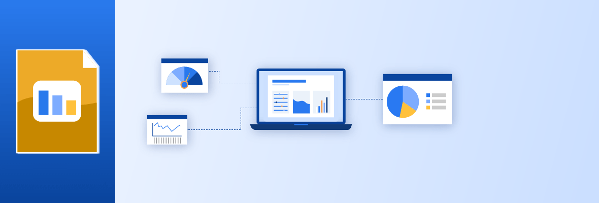
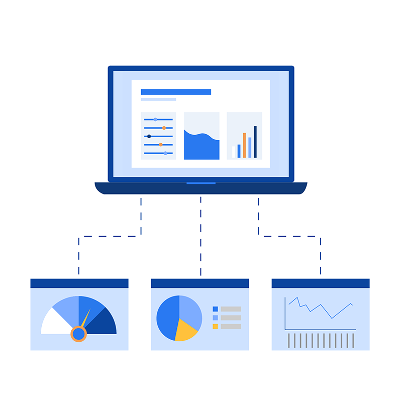
You can then identify how you would like to display your report. A few of the most commonly used visualization tools include:
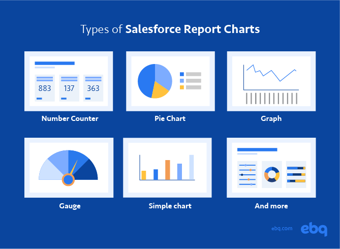
EBQ Tip: Consider configuring the colors associated with the numbers displayed in your graph. Because your team members should spend more time working and less time understanding their data, you must understand how to showcase these numbers more easily for your stakeholders.
Salesforce’s Trailhead provides a resource library to help you make the most out of your instance.
Now that you are aware of what reporting options are available in Salesforce, let’s talk about how to build a report.
Before you start, make sure that every report and dashboard serves a specific purpose. We see a lot of organizations getting overly excited about creating complex reports that end up confusing staff, thus slowing down their workflow.
To make sure you are creating meaningful reports, ask yourself the following questions:
Once you get that ironed out, it’s time to create reports in Salesforce:

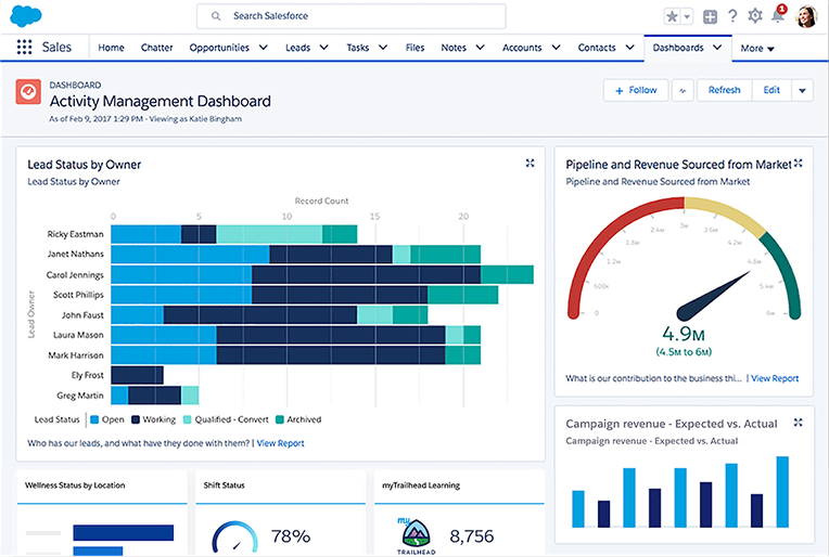
In Salesforce, dashboards are collections of relevant reports all displayed in one single pane of glass. Keep in mind that dashboards are meant to be high-level, so choose these reports appropriately.
Before we dive into how to build a dashboard, let’s go over some key best practices to be mindful of:
By following these best practices, you’ll increase your user adoption and effectively leverage your CRM data. That’s because an organized dashboard empowers your users to view all relevant data at once — helping them understand how close they are to meeting their unique goals.
These are the steps to creating a dashboard:
Now that you know how to create Salesforce reports and dashboards, let’s go over some examples of how these reporting tools can look.
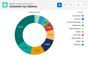
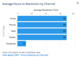
Below are 4 examples of how the customer service department can utilize Salesforce reports:
Find out which industries your clients operate in and the top sectors for your business.
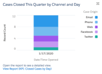
Find out how long it takes for an issue to be resolved.
Understand how many issues your customer service representatives receive on an average day.
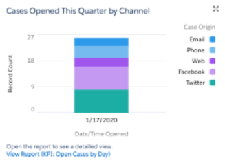
Figure out how many issues are resolved per day.
EBQ Tip: We have written detailed guides on how to utilize CRM reports for specific departments.
Below are 4 examples of what dashboards can look like for each department:
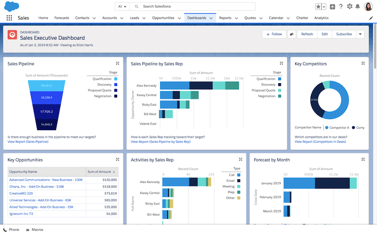
Typically, executive-level dashboards consolidate all department KPIs into one single source of truth.
Depending on your marketing goals, this usually displays how many leads are funneling into your sales pipeline and from which lead source.
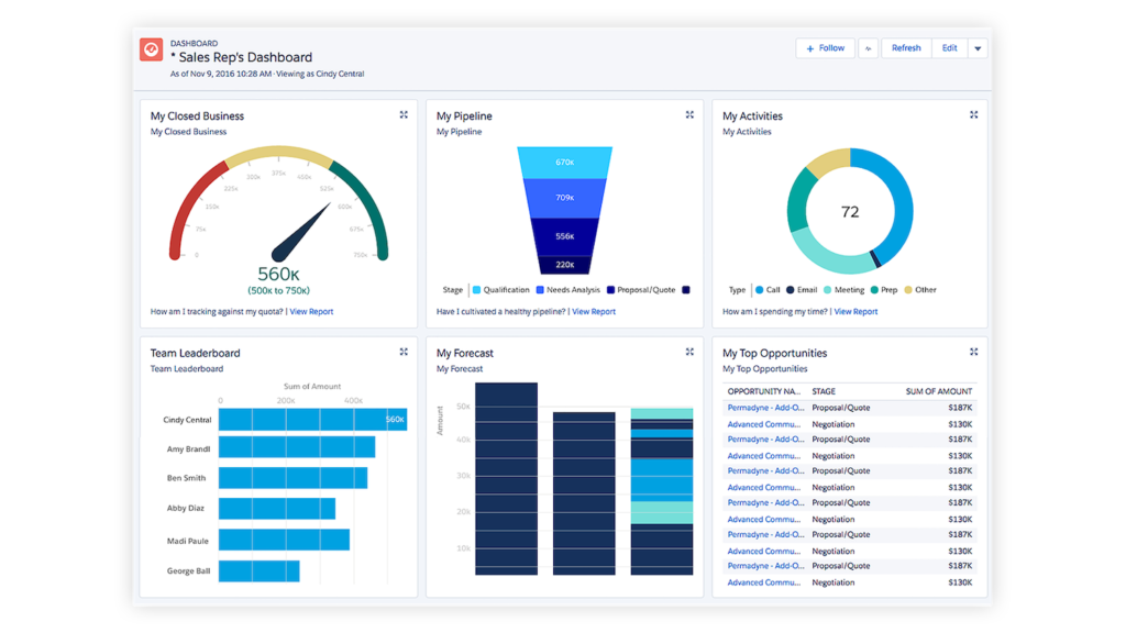
From our experience, this typically indicates how many touches are performed in a given day, how much revenue has been generated over the month, and who are the leading salespeople within your department.
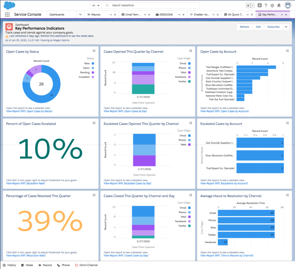
For a customer service dashboard, we recommend honing in on how many tickets are handled and how long it takes to reach a resolution.
Don’t have time to read the whole guide right now? Download the PDF version of the guide.
We hope that this chapter — and this guide — gave you a great starting point on how to kick-start your Salesforce journey. With the right strategy in place, each of your departments should begin to maximize their Salesforce utility.
As a reminder, the three biggest tips on how to create Salesforce reports and dashboards are:
Of course, maximizing your Salesforce CRM will require some specific skills. Our certified experts can help with Salesforce to help you maximize your ROI and get you using your tool at its full potential.
Not only do we pair you with a seasoned administrator, but you also get the support of a full CRM team for a fraction of the cost of building it internally. Visit our Salesforce Consulting page to learn more.