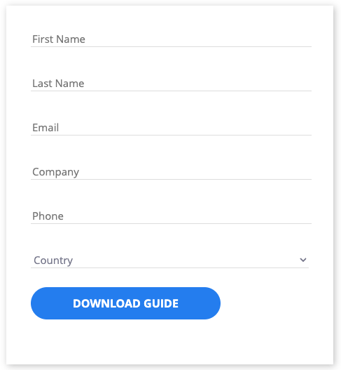
Pardot’s default form styling can be somewhat lackluster. We thought it’d be helpful if we shared one of our forms with you and explained how we went about making it.
This form is the same form we currently use on most of our landing pages, including the landing page for our Beginner’s Guide to Pardot.
Let’s jump in!


Beginner’s Guide to Pardot
Download our expert-created guide to begin your journey with Pardot.
How to customize your Pardot lead form
First things first, you’ll need to create a new layout template and attach it to a form. Because we are heavily styling this form, we don’t want to include default Pardot’s CSS. Make sure to uncheck “include default CSS” on the “Layout” tab of the layout template editor.
It’s important to note that this form doesn’t use radio buttons or checkboxes. This means that your mileage may vary when using this styling guide with those field types.
1. Removing the boxes
Our goal with this custom form was to create a relatively simple form that isn’t stylized like a typical Pardot form. We wanted to think outside of the box, so we got rid of the boxes on our form. From a CSS perspective, this is relatively easy to do.
The fields themselves are really just 1px thick border boxes, so all we need to do is hide the left, top, and right borders by setting their widths to 0px.
In our layout template that’s attached to our form, we added the following code to our CSS:
/*Single Line Field Tweaks*/
form.form input {
border-top-width: 0px;
border-left-width:0px;
border-right-width:0px;
border-color: #DDD;
border-bottom-width:1px;
}
/*Stylizes Dropdown Menus*/
select {
border-color: #DDD;
border-top-width: 0px;
border-right-width: 0px;
border-left-width: 0px;
color: #75758B;
}
If you preview your form now, though, you’ll notice something a little odd.
The unselected field is now a single line, but the selected field will show a box around it. Luckily there’s an easy fix for this. This code will tell the visitor’s browser not to render the selection of the box:
/*Hides Outline Around Fields*/
input.text {
user-select: none;
padding-left: 5px;
}
input.text:focus {
outline: none !important
}
select:focus {
outline: none !important
}
But like most things in CSS, fixing one problem causes another. Now we have a very real problem: the user can’t clearly see which field they’re typing in.
Our solution here was to simply change the color of the bottom border with a smooth transition.
/*Transitions Bottom Border to Blue*/
form.form input.text:focus {
border-color: #2979f2;
border-bottom-width: 1px;
transition-duration: .3s;
transition-timing-function: ease-in-out;
}
select:focus {
border-color: #2979f2;
}
Whenever someone clicks into one of the fields, the color of the bottom border changes to our EBQ branded blue.
2. Placeholder Text
For our forms, we decided to use placeholder text instead of labels.
This JavaScript should be added between <script> tags at the bottom of the “Form” tab of the layout template, not in the Layout tab.
This JavaScript is sourced from dedevillela on CodePen.
var labels = document.querySelectorAll(“label”);
var i = labels.length;
while (i–) {
var label = labels.item(i);
var text = label.textContent;
label.parentNode.classList.contains(“required”) && (text += “”);
label.nextElementSibling.setAttribute(“placeholder”, text);
}
var selected = document.getElementsByClassName(“select”)[0];
selected[0].innerHTML = selected.attributes.placeholder.nodeValue;
selected[0].value = “”;
}
You’ll then have to add another snippet to the CSS because we’ve only added new labels into the field and haven’t removed the old ones.
/*Hides Default Labels*/
labels {
display:none !important;
}
3. Adding fonts & stylizing text
There are a few ways to add fonts to Pardot, and the best method depends on which fonts you use for your branding. The easiest fonts to add are Google Fonts, which can be added via a couple of lines of HTML.
For our branding, we used a Google Font called “Open Sans.” To insert this Google Font into a form, you need to visit the Google Fonts page for the font, select the particular style you want to use, copy the embed HTML code provided on the left side of the page, and then paste that into the tags of your form layout code.
After that, you can use CSS to style the different types of text in your form.
You’ll notice that after font-family, there are two font names. The first name, “Open Sans,” is the font we’re using in the form, and the second name is our fallback font.
Some older browsers (and some modern ones too) don’t like pulling font files from third-party sites. So, we need a fallback sans serif font to make sure our forms at least roughly follow our vision. Otherwise, it will default to a serif font like Times New Roman.
You might also notice our use of !important in some of our CSS. This sometimes needs to be included for lines of styling that don’t appear to be working. The !important tag ensures that those particular lines of CSS will override any default code stopping it from rendering.
/*Text Styling*/
p {
font-family: Open Sans, sans-serif;
font-weight: 300;
}
/*Input Text Styling*/
body form.form input.text, body form.form select {
width: 100% !important;
font-family: Open Sans, sans-serif;
font-size: 15px;
}
4. Styling the button
We really wanted our buttons to match what we had on our website, so we took the code we had for our website buttons and applied it to the form.
We applied separate styling for our button hover so a drop shadow appears when someone hovers over it. Even though we use a lot of code here, your buttons don’t need to be nearly this involved. We just wanted to make sure that we offered a consistent experience across our website and our forms.
/*Button Styling*/
form.form p.submit input {
border-radius: 44px;
color: #FFF;
font-family: Open Sans, sans-serif;
font-weight: 600;
font-size: 16px;
padding: 13px 18px;
position: relative;
text-transform: uppercase;
margin-bottom: 10px;
opacity: 1;
line-height: 20px;
display: inline-block;
border-width: 0px !important;
background: #2979f2;
padding-left: 60px;
padding-right: 60px;
margin-left: 0px !important;
}
form.form p.submit input:hover {
background: #203D76;
}
5. Error Text Tweaks
Beyond these steps, we made a few additional but minor tweaks to stylize the error text to our branded orange.
/*Recolors Error Text*/
.errors {
color: #F49E54;
}
.error .no-label {
color: #F49E54;
}
You can see that, with just a little CSS, there are many ways you can improve the visual appeal of your Pardot forms. Now try these customizations on your own forms and see if you can create something unique for your brand.
Interested in learning more about Pardot? We wrote the Beginner’s Guide to Pardot — free for anyone who wants to take their understanding of Pardot to the next level.

Beginner’s Guide to Pardot
Download our expert-created guide to begin your journey with Pardot.


