Effective email marketing design helps you engage your audience in a quick manner and increases your click-through rates. On average, people spend 10-12 seconds reading an email. Without effective email marketing design, your email may get sent to trash, your contacts may click the back button before reading it, or they may think of you as spam.
Especially if you’re targeting B2B buyers, it is important to ensure the design of your email will keep your readers interested. Remember, you aren’t the only one sending emails to these businesses. B2B buyers receive hundreds of emails each day; effective marketing design can make you the one email that they read.
Although email marketing is just one aspect of your marketing strategy, it is a great channel to acquire marketing-qualified leads (MQLs).
The design of your emails can greatly affect whether you generate leads or not. After reading through this article, you will have the tools and confidence to create effective email marketing designs.
The first practice for effective email marketing design is learning how to create HTML emails.
How to create HTML emails
In order to create HTML emails, you’ll need a marketing automation platform such as Pardot or HubSpot to help you get started. These platforms offer drag-and-drop builders, let you edit code directly, and let you create reusable templates.
Creating HTML emails can be a learning curve, but these tools make it much easier. If you feel lost about marketing automation platforms, we offer guides to help. Read our B2B Guide to Marketing Automation to help you get started.
If you want to create your own HTML emails, here are some best practices to keep in mind:
- Keep your layout simple. For example, don’t have multiple columns of text and floating images.
- Be aware of how long it takes for your email to load. To ensure smoother load times, use images sparingly, avoid custom fonts, and make sure your message still makes sense if the images don’t load.
- Test your email at every stage of development. You don’t want to catch an error at the very end of the process and have to backtrack from your mistakes.
Always remember to be patient as you build and test your HTML email. However, building an HTML email is only the beginning. Below we will discuss more best practices for effective email marketing design.

Download the B2B Guide to Marketing Automation
Find out how you can elevate your omnichannel messaging using our marketing automation tips.
How to make your emails look professional
As you design your email, it is important to avoid unnecessary clutter. This includes too many images, columns, and jargon.
Remember that feeling when you walk into a cluttered room? That’s the same feeling readers get when they see a cluttered email. Keeping your layout neat helps give it that clean, professional look that will keep readers engaged.
That’s because it makes it easier for the reader to digest. It also ensures that your reader will trust you more because a professional-looking email makes your brand look more credible.
It also helps to have both a designated designer and digital marketer on your marketing team because they have experience creating these emails. Since designing emails is a part of their skillset, the designer will give you the best layout for your emails. Then, the digital marketer has the expertise to build and manage the emails in your email platform. With each team member’s knowledge, you will get the best result.
When building emails for clients, our designers start by mocking up the template then our digital specialists create the email in their marketing platform. Explore the EBQ Marketing Lookbook for examples of our work.
How to use images in emails
Including images in your email is a great attention grabber. Effectively incorporating them is key. A good rule of thumb to follow is to do your best to only include images that serve a purpose. If you want to include other images for decoration, make sure to keep them to a minimum.
Are you worried you might not have enough or too many images? 3-10 images are all you need to engage a reader.
To ensure the images load quickly, the ideal image size should be around 2.7MB. It is also important to make sure your images are either JPG, PNG, or GIF. These file types are the best when it comes to loading times.
Loading times are extremely important when it comes to making your emails mobile-friendly.
How to create a responsive email
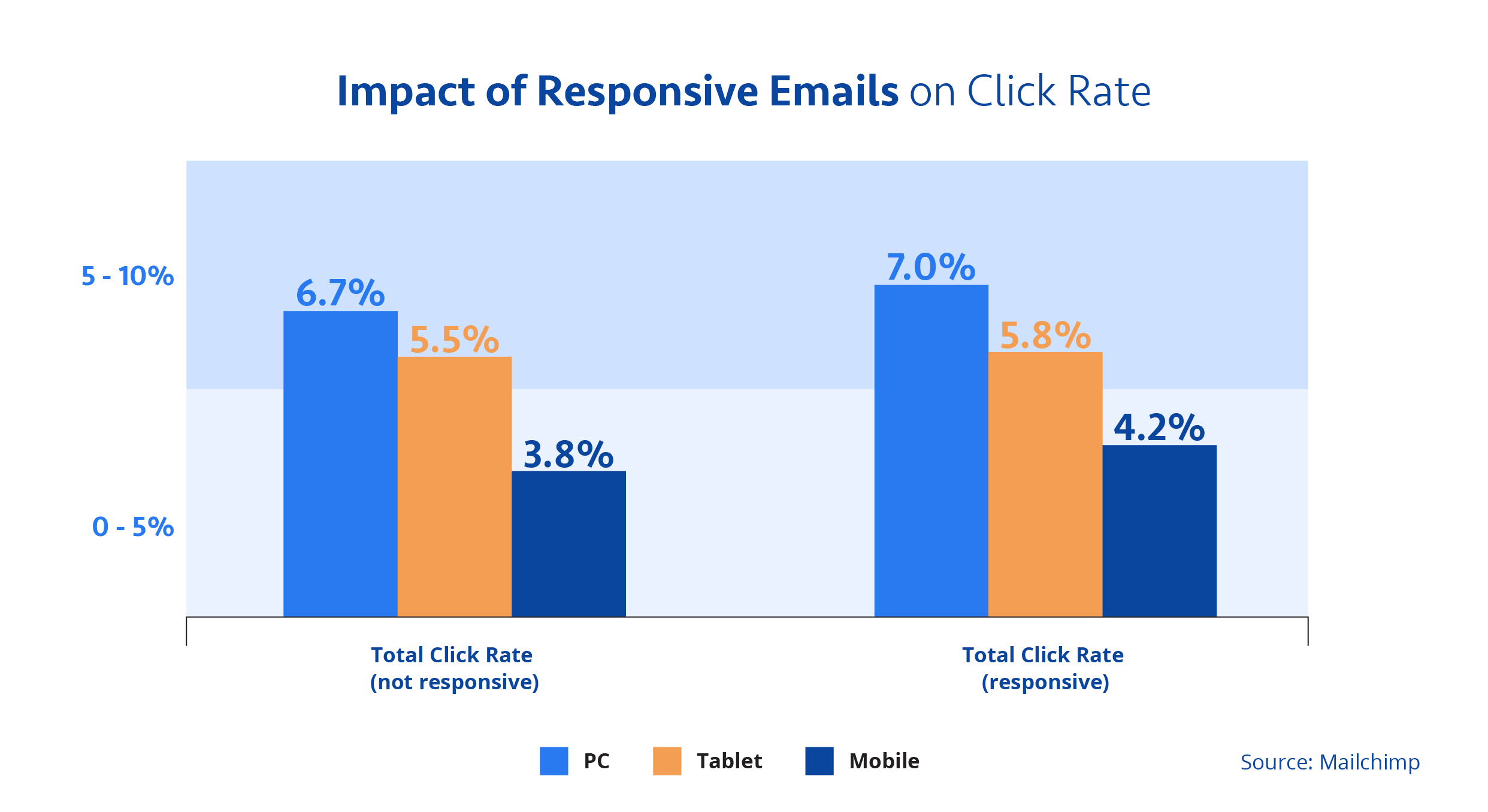
In this day and age, people are viewing content on different screens. That is why you want to ensure your email can be viewed on a variety of devices and screen sizes. If your email is not responsive then that will only frustrate your readers. In turn, you’ll lose out on potential leads and customers.
One of the great benefits of responsive emails is that the click rate improves across all screens.

The top priority is making your email mobile-friendly. As mentioned earlier, you want to have a simple layout. Having multiple columns creates more issues on phones. So keep your email to one column, or specify in the code that it should display as one column on smaller screen sizes. When formatting your email, do not forget to keep images small as well.
Set the width of your email to 600px. This is the ideal width to view emails on all platforms. Be sure to have your font size be 13- or 14-pt font for the body, while your font size should be around 20-pt font for the titles.
When it comes to creating responsive emails, email testing and rendering are extremely important. You may think the email is ready for multiple screen sizes, but you can still run into issues.
Email testing allows you to view your email before sending it out. Many platforms like Hubspot, Pardot, and Mailchimp allow you to send a test email to yourself.
The point of testing an email is to help catch:
- Broken email designs
- Broken images or missing alt text
- Incorrect links
- Incorrect subject line
- Spelling and grammar errors
Remember, you can never test your email too many times!
Email rendering is another aspect to effective email design that is just as important, especially for responsive design. While email testing catches any errors, rendering gives you a preview of how your email will be displayed on a variety of email clients and devices.
To help emails render properly, it is best to follow these practices:
- As mentioned before, emails need to be sized around 600px wide
- Keep emails under 102KB in size to help with load times
- Avoid custom fonts and use universal fonts such as Arial or Helvetica
The best way to check if an email properly renders is by previewing your email throughout the design phase. As you set certain fonts and sizes, always test your email by sending previews to yourself. Also view your test email on multiple devices.
Most email marketing platforms, like Hubspot, Pardot, and Mailchimp, offer tools to render and test your email for different devices and email clients. Testing your email can save a lot of time and save you from potentially ruining your chance of generating leads.
Now your readers can enjoy your email on their commute to work!
How to write effective email marketing content
Once you’ve figured out the layout, your next step is to focus on the message. Your email can look as nice as possible, but without a clear message your email will go to waste.
When it comes to the actual copy of the email, it is important to stick to these tips:
- Stick to a single message throughout the email.
- As you write your message, keep in mind who your audience is. Which audience segment are you targeting? Proper segmentation requires the right message for each.
- Be concise and keep your word count between 50 to 125 words.
- Use images, bulleted lists, and headers to break up your sentences.
Keep in mind that the message in the email is only one aspect of your email to engage readers. The overall flow and ease of reading are just as important. Just like a camera tripod, if you take away one aspect from your email it won’t be able to stand up on its own. All three elements are important.
How to write a call-to-action email
You’ve written and designed an amazing email. Now it is time to hit it home with a call-to-action (CTA). The purpose of a CTA is to give your readers something to do. They viewed your email, now it’s time to turn that knowledge into action.
The call-to-action can be a link to free content, such as an eBook. It can be a link to contact you, to schedule an appointment, sign up for an event, or purchase a product.
How many CTAs should you include in an email? Only include links that match the message you are trying to convey. Depending on the type of email, you only need to include a single link in the email. However, you can place that link multiple times throughout the email.
Exceptions to this recommendation could include newsletters or roundups — where the goal is to send a selection of different web pages or content pieces for the reader to explore.
When including a link, ask yourself “why am I including this link? What do I want the outcome to be?” Perhaps you want to direct the user to another blog on your website. Or maybe you want the link to take them to a certain product. Make sure it is clear to the reader what action you want them to take.
The best practices make the best email
The layout of your email can be the difference that separates you from your competitors. Following these best practices for effective email marketing design will give you the advantage that will engage readers, which will result in improved click-through rates and increased conversions.
Still need help designing your emails? EBQ’s marketing specialists can help your emails come to life.


